In late 2020 at Cleverclip we decided our website needed a breath of fresh air. We wanted to reduce the visual clutter, simplify the architecture of the website and let the work we make for clients take the center stage.
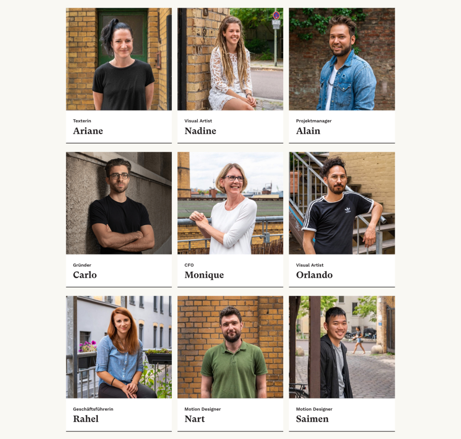
I managed a team of two copywriters, an animator, a developer and illustrator to deliver this redesign in three different languages. In the process we redefined the illustration style, color palette and fonts used not only in the website but in all other brand materials and deliverables.
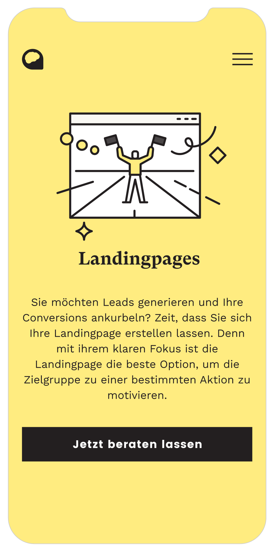
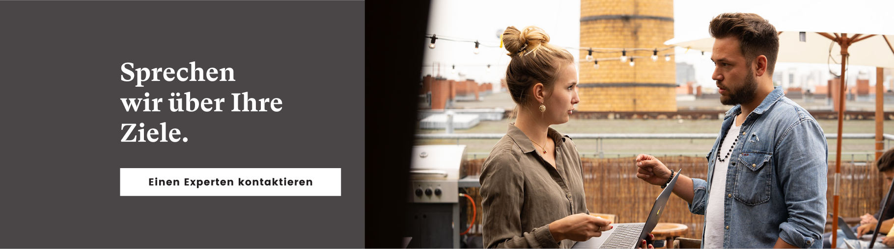
The most glaring issue we had in the previous version of the website was that the thumbnails of the videos we make for clients would compete too much for attention with various elements on the website. The primary reason for this was that our color palette was all over the place (disclaimer: I had proposed the palette myself, ha).
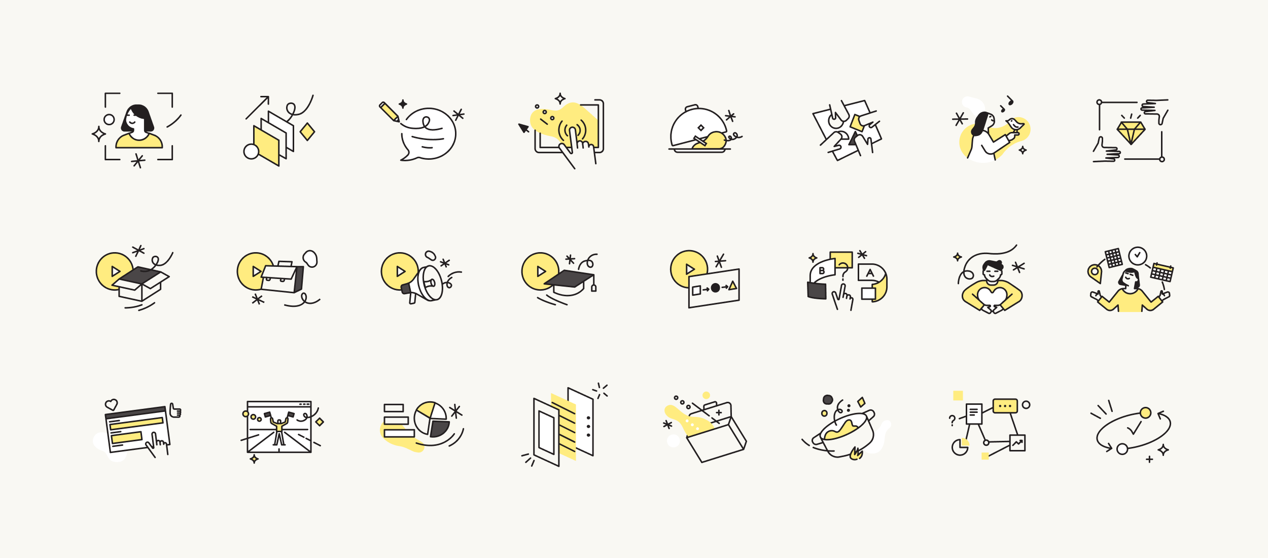
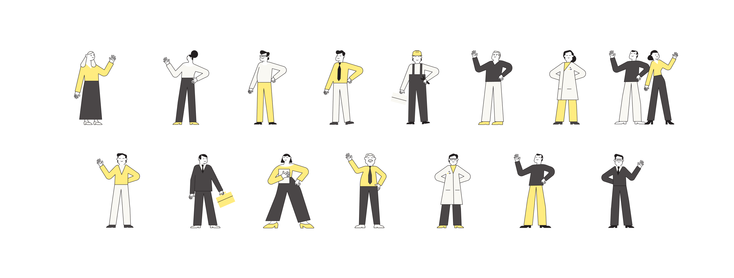
To tackle this opted to reduce our color palette drastically to just black, white and yellow. After this, there was a lot more of breathing room for everything.We switched our main font from Tiempos Headline to GT Super, both somewhat similar but GT Super worked more harmoniously with the new palette and illustrations.

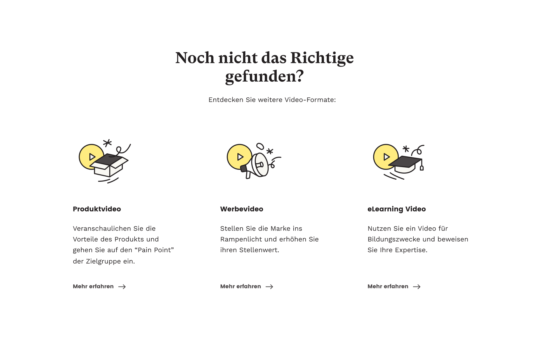
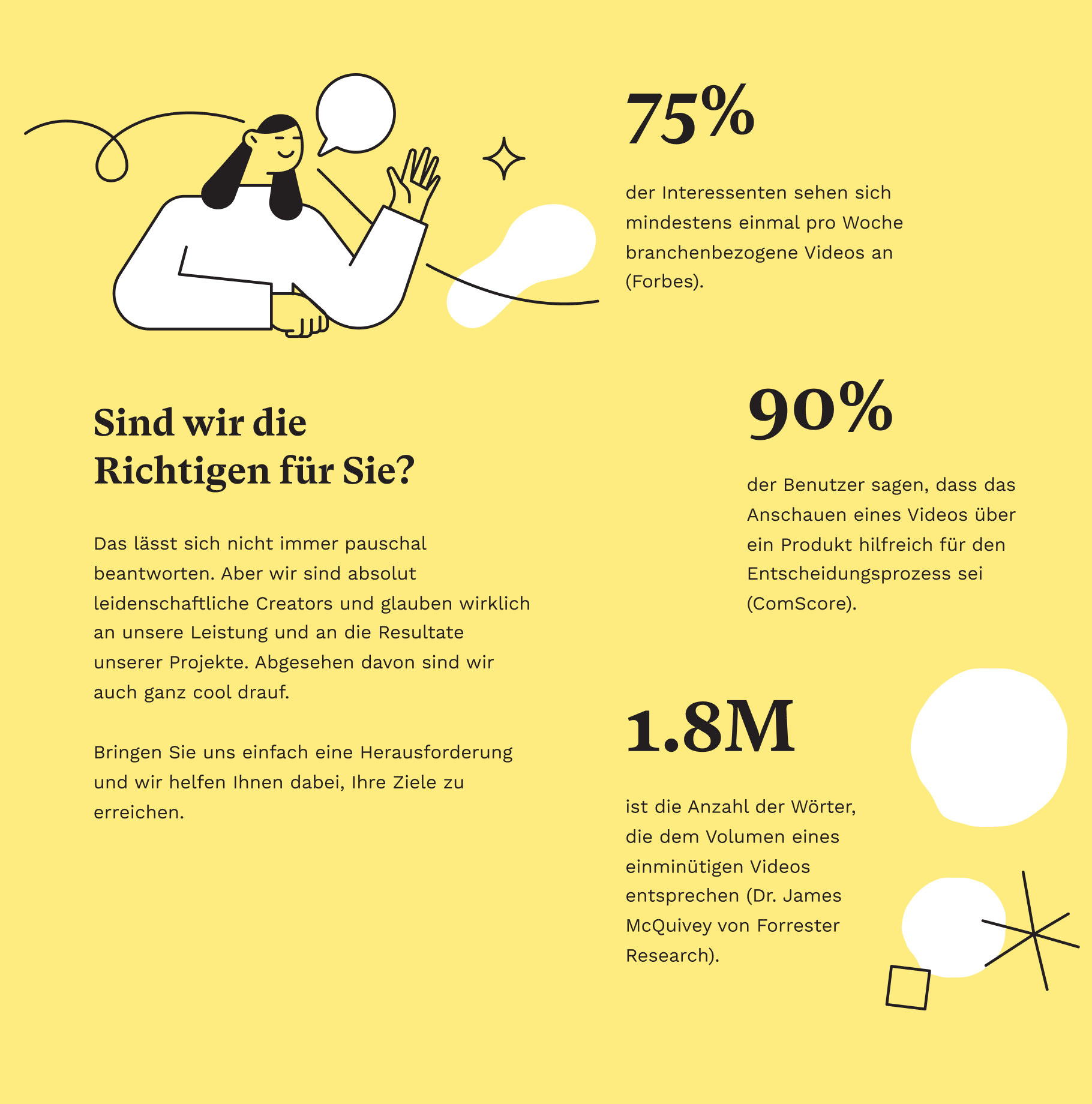
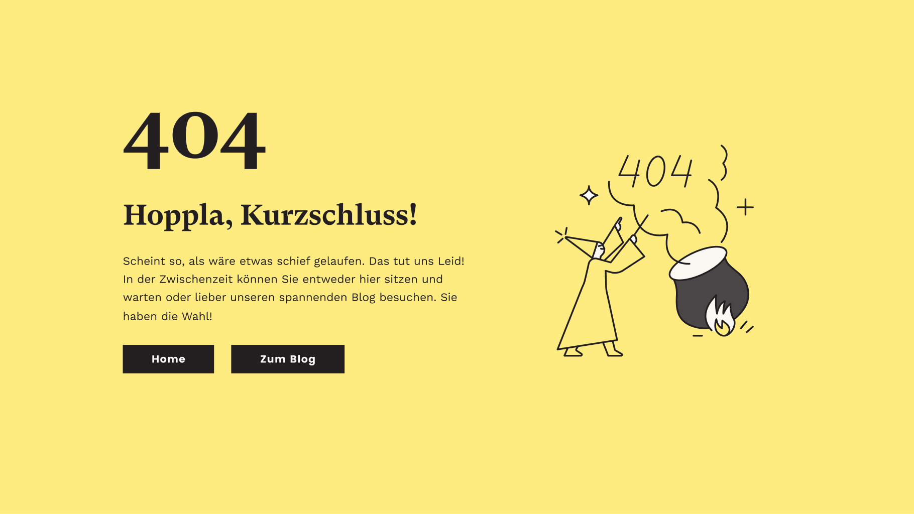
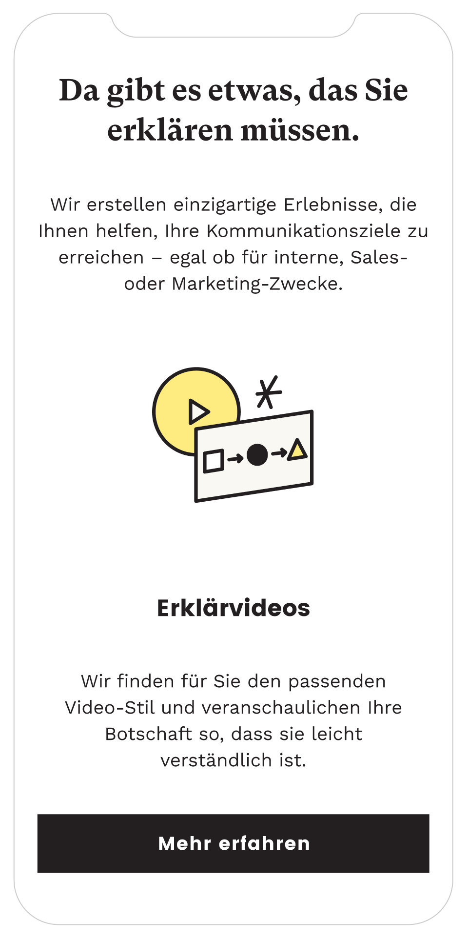
We use illustration a lot at Cleverclip, from email signatures to every single deliverable presentation we send to clients. They play a key part in positioning ourselves as storytellers.
The reduced color palette also helped the illustration style a lot, making pieces more cohesive and expressive.
We opted to discard all of our previous icons as they felt extremely stiff and didn’t have the same dynamism as the illustrations. We did them all again, and the results were orders of magnitude better.
Considering the redesign was more of a ‘re-skinning’ of the website rather than a full overhaul of the UI, I feel the result was incredibly successful in making it easier on the eyes and have client work pop-out more.
It was a rewarding experience for me as I had proposed the original website and it seemed good initially. But shortly after, it felt like too much was going on and it lacked focus. Revisiting with more experience and that with relatively few changes it improved dramatically felt like a great validation of all the work I had put into improving my UI design in the previous couple of years.
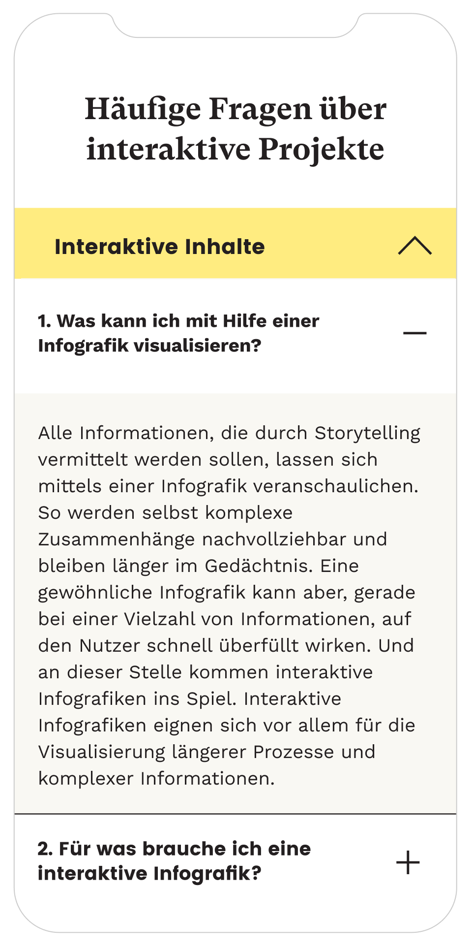
My only complain would be that I would have reduced the amount of copy on the website significantly, but since SEO was really our key priority, not much copy could left out.
Bea Barquero & Alejandro Bonilla | Illustration
Jakob Skorupa | Video Editing
Natalie Ediger & Marc Bachofner | Copy Writing
Huba Gaspar | Developer