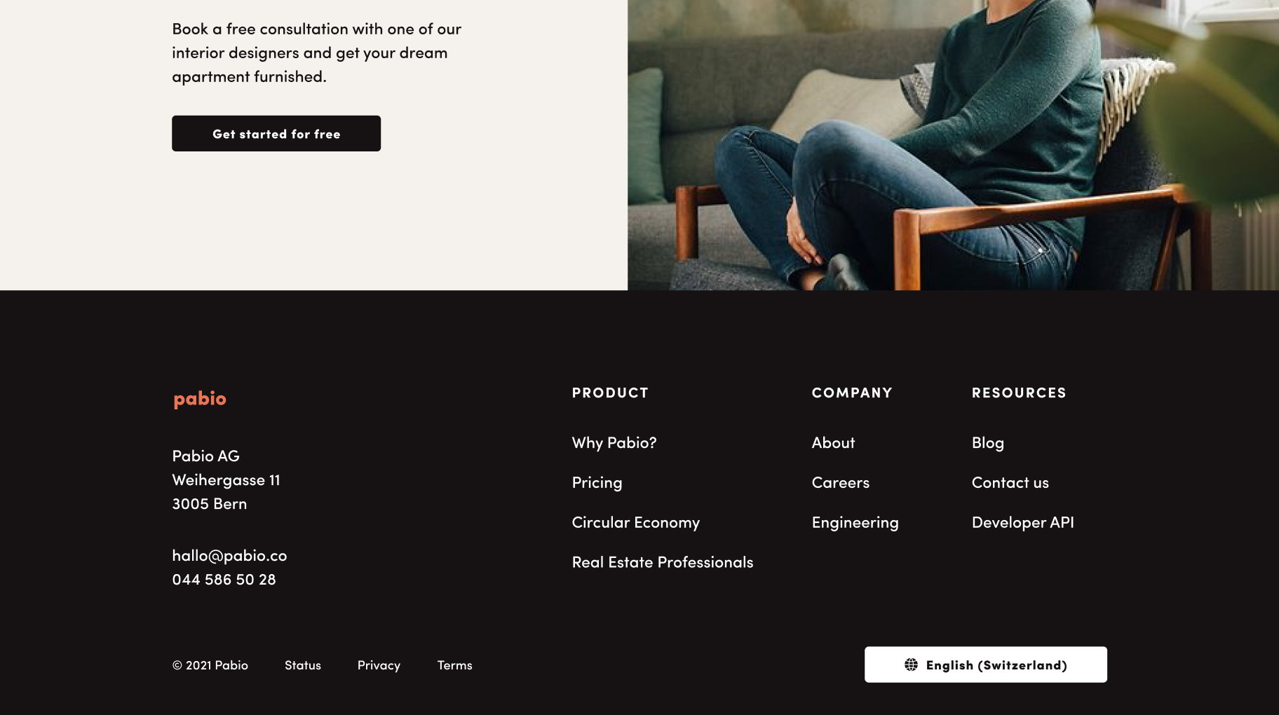
Pabio is an interior design subscription service based in Switzerland. Originally launched in 2020 under the name Koj, its founder wanted to have a brand refresh in 2021 along with an update on their website.
I did the website redesign along with Bea Barquero, who also did all of the illustrations.Shortly after launching the new design, Pabio raised $1M in pre-seed and joined Y Combinator.
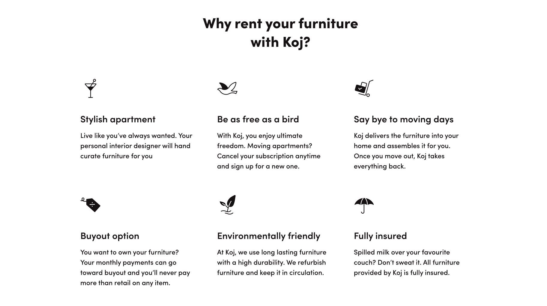
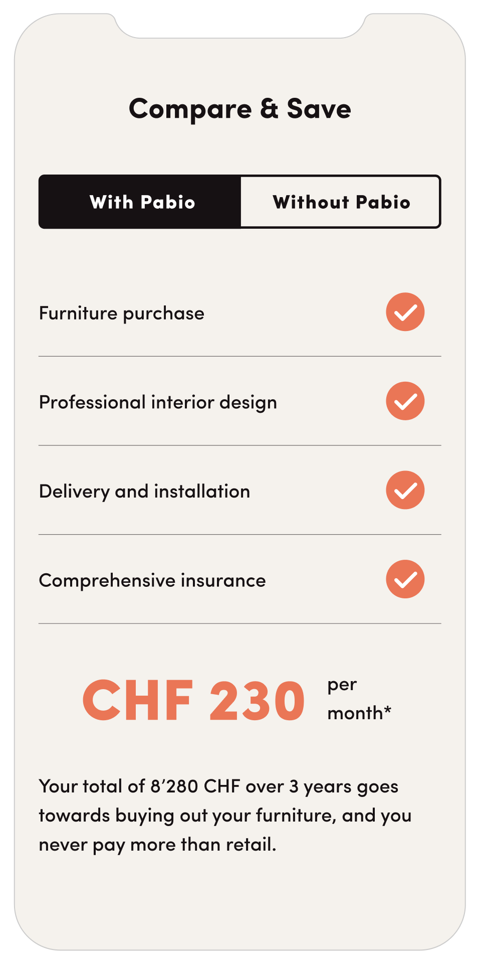
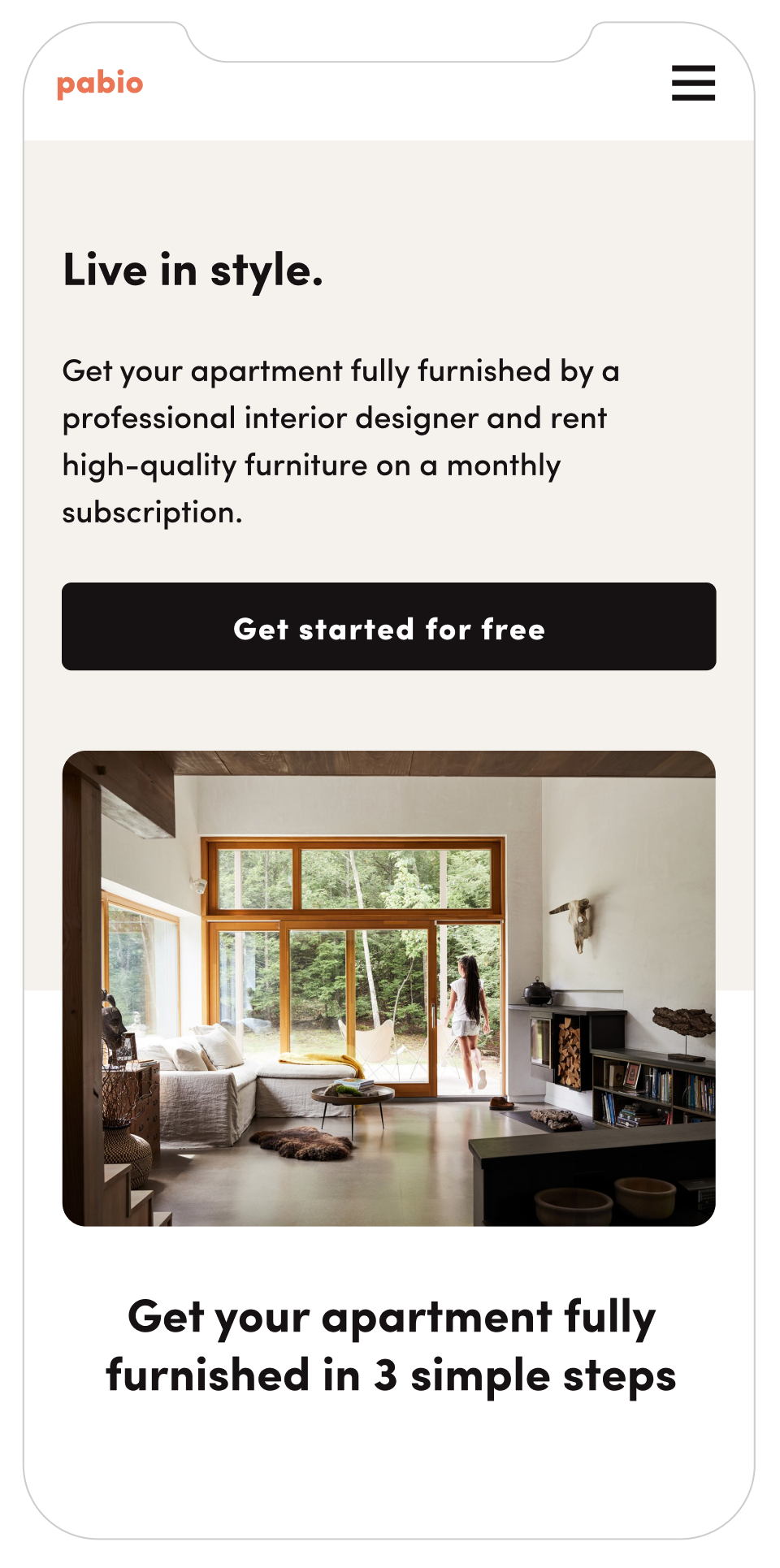
Their initial design didn’t stand out much and didn’t really communicate the pleasure of living in a beautiful space. One key aspect on which the client wanted us to focus on was to make the brand more friendly and approachable. The service, by Swiss standards, was affordable, but the previous brand and website gave an impression of being solely for very wealthy customers.
I tackled the wordmark and brand color first, both of which resulted in a simple but appealing logo. One important thing here was that the brand needed to appeal mostly to men. Before starting, the Pabio’s team assumed its clientele would be mostly women. But as the service gained users, the exact opposite turned up to be true, with up to 80% of clients being men between 30 and 50 years old.
On the left is the original name and wordmark. On the right is our proposal.
Through the UI we relied on the use of textures and brush strokes to generate accents and give the site a bit more personality. With these, we wanted to reference the idea of working on a physical mood board with an interior designer.
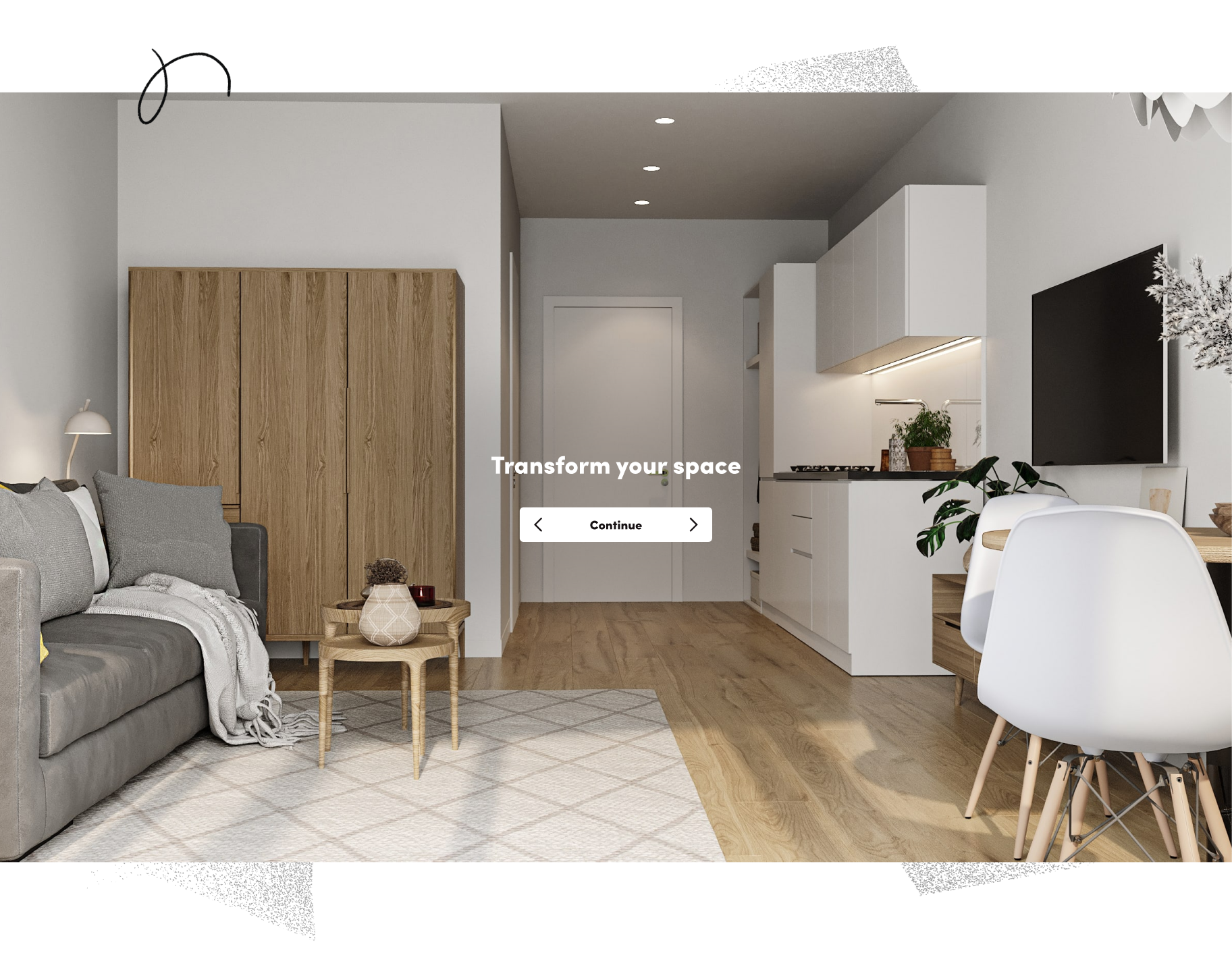
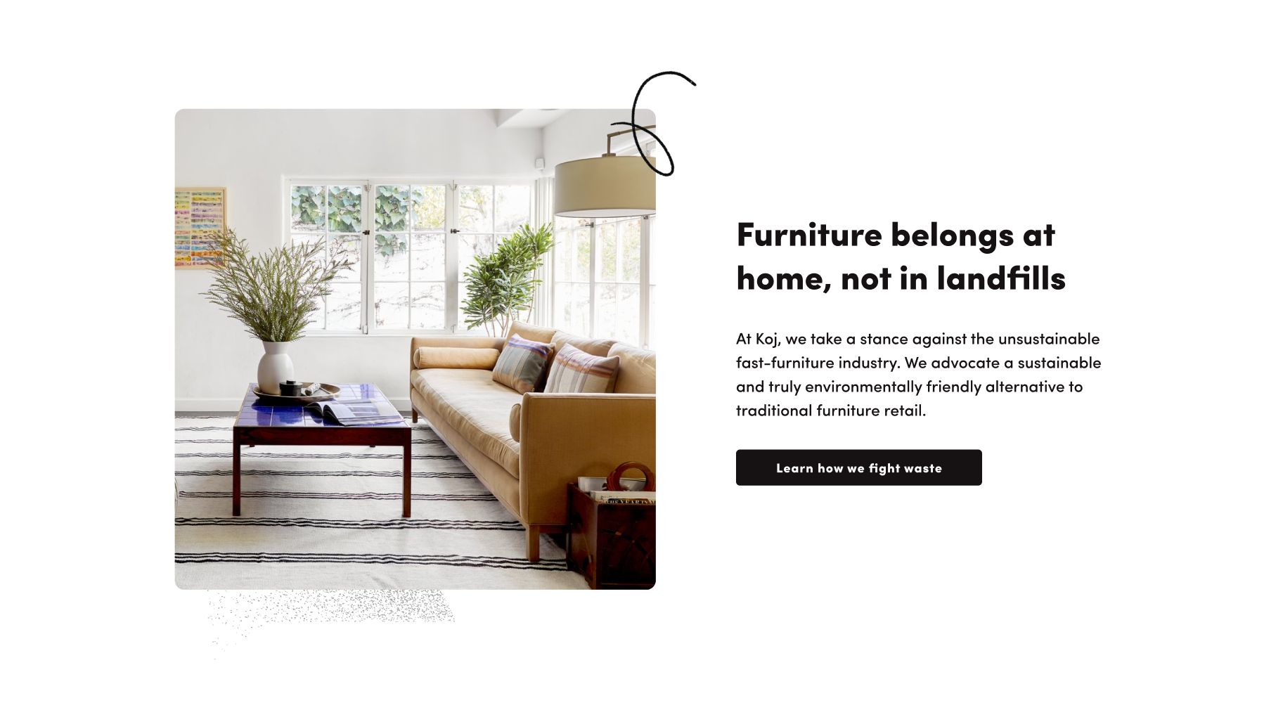
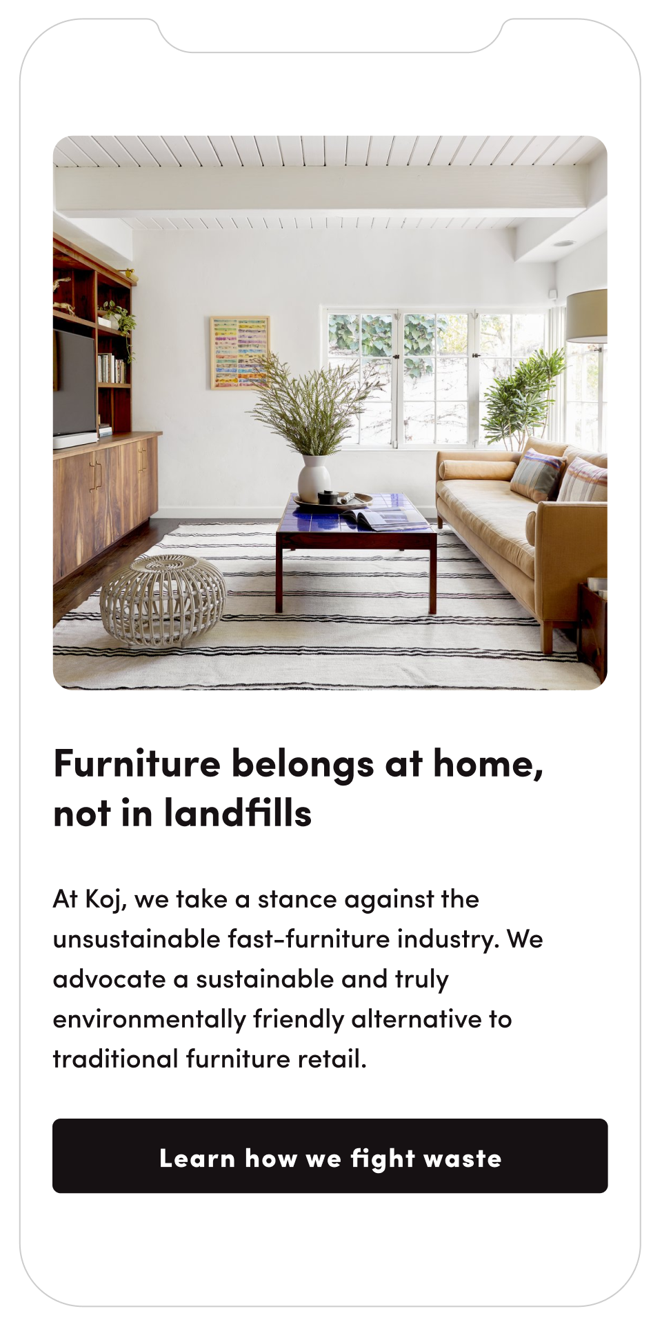
We set a few guidelines of how photos should look like, as photos and renders were doing the most work in attracting the user and helping them envision what is possible with the service. The key criteria is that all photos/renders need to present spaces that felt ‘lived in’.
A minor detail that turned out to help a lot in this design was the use of rounded corners, which really helped to turn up the ‘friendly’ factor.
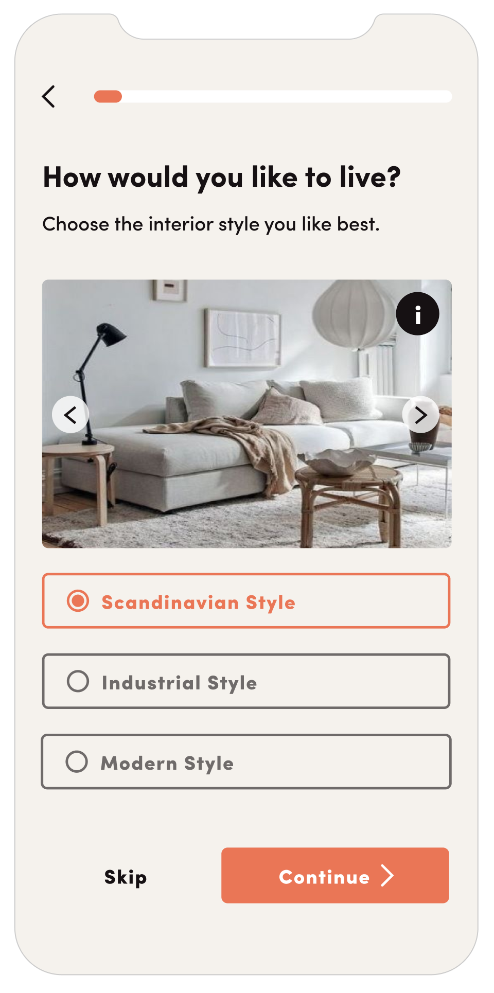
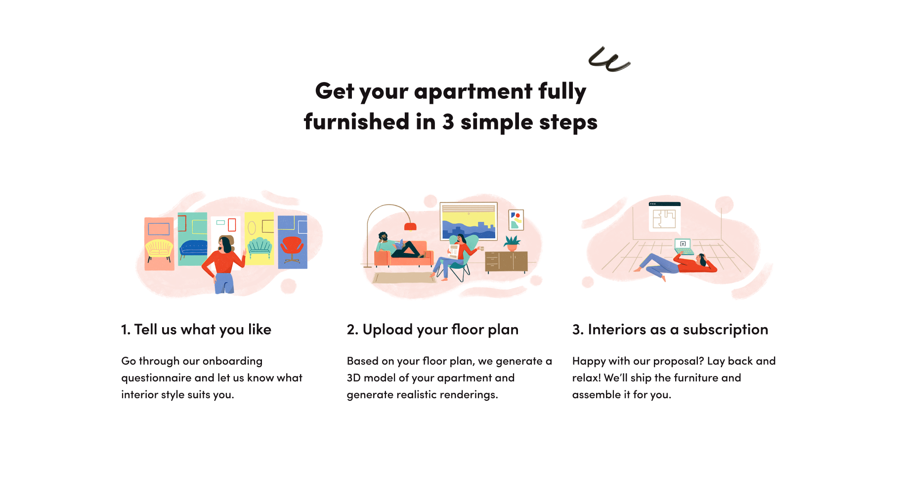
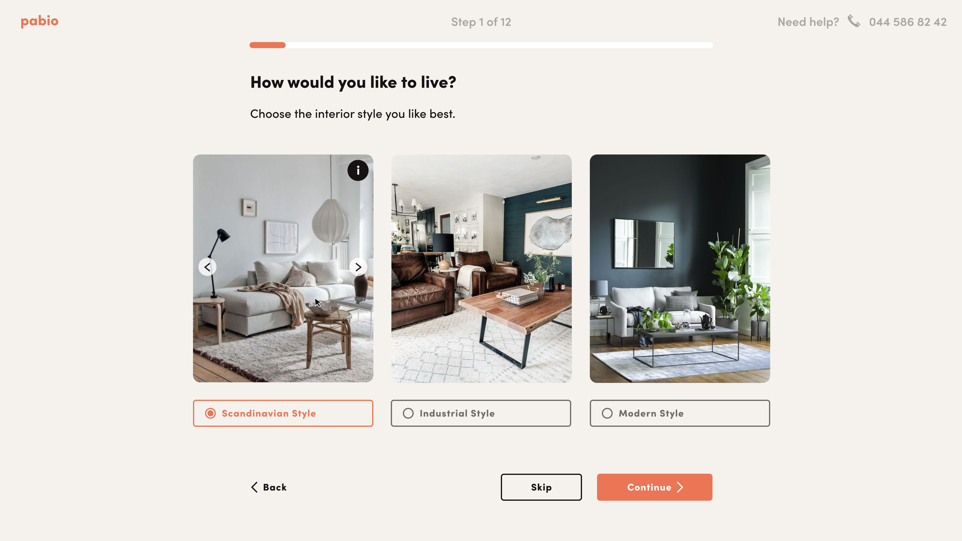
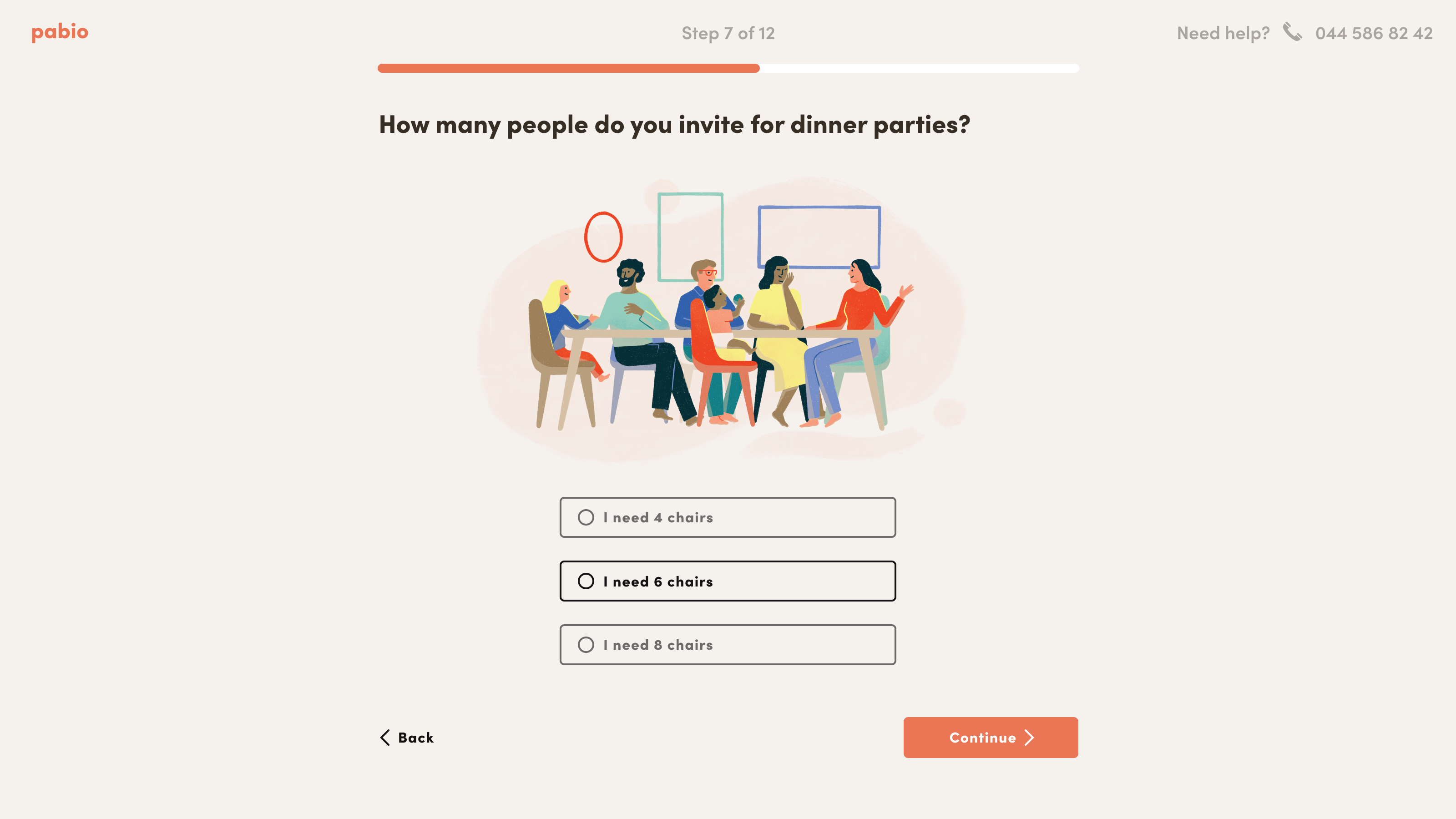
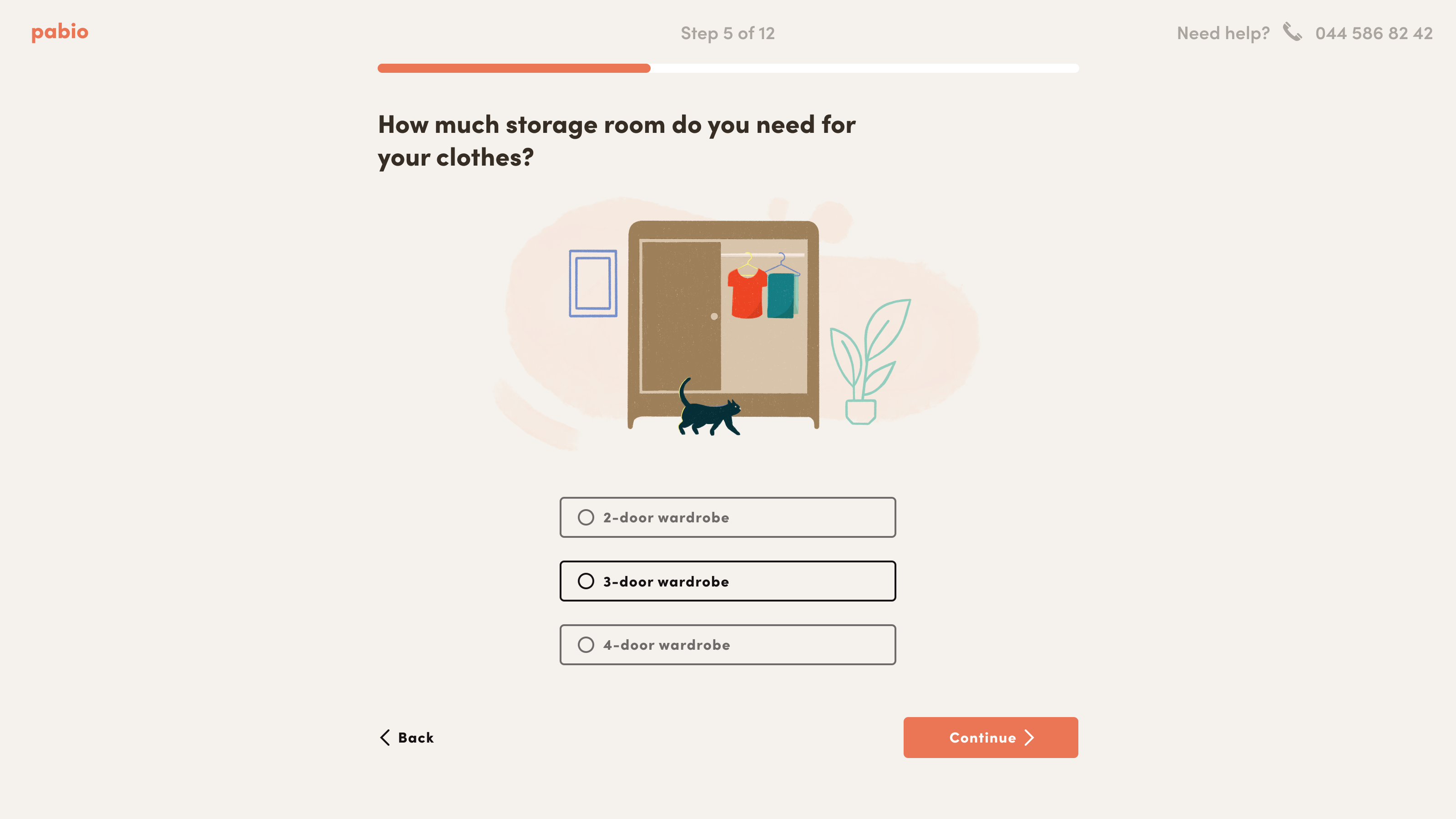
The onboarding experience was the main UX challenge. The previous onboarding had a lot of inconsistencies and the experience was quite dull.
We needed to keep the user engaged to complete their profile and share their needs for their space. We implemented more polished interactions, illustrations and animations to motivate the user to reach the end.
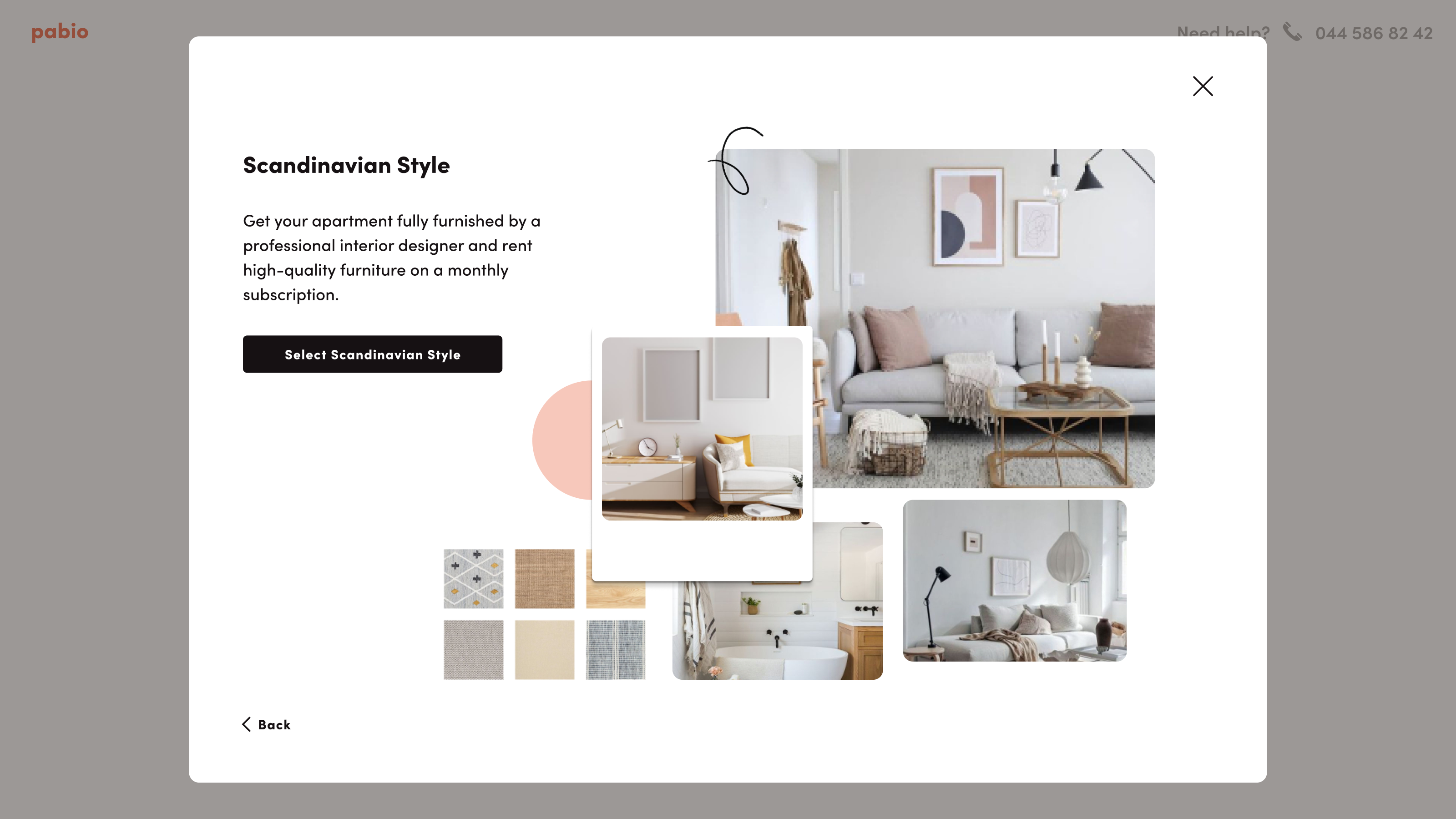
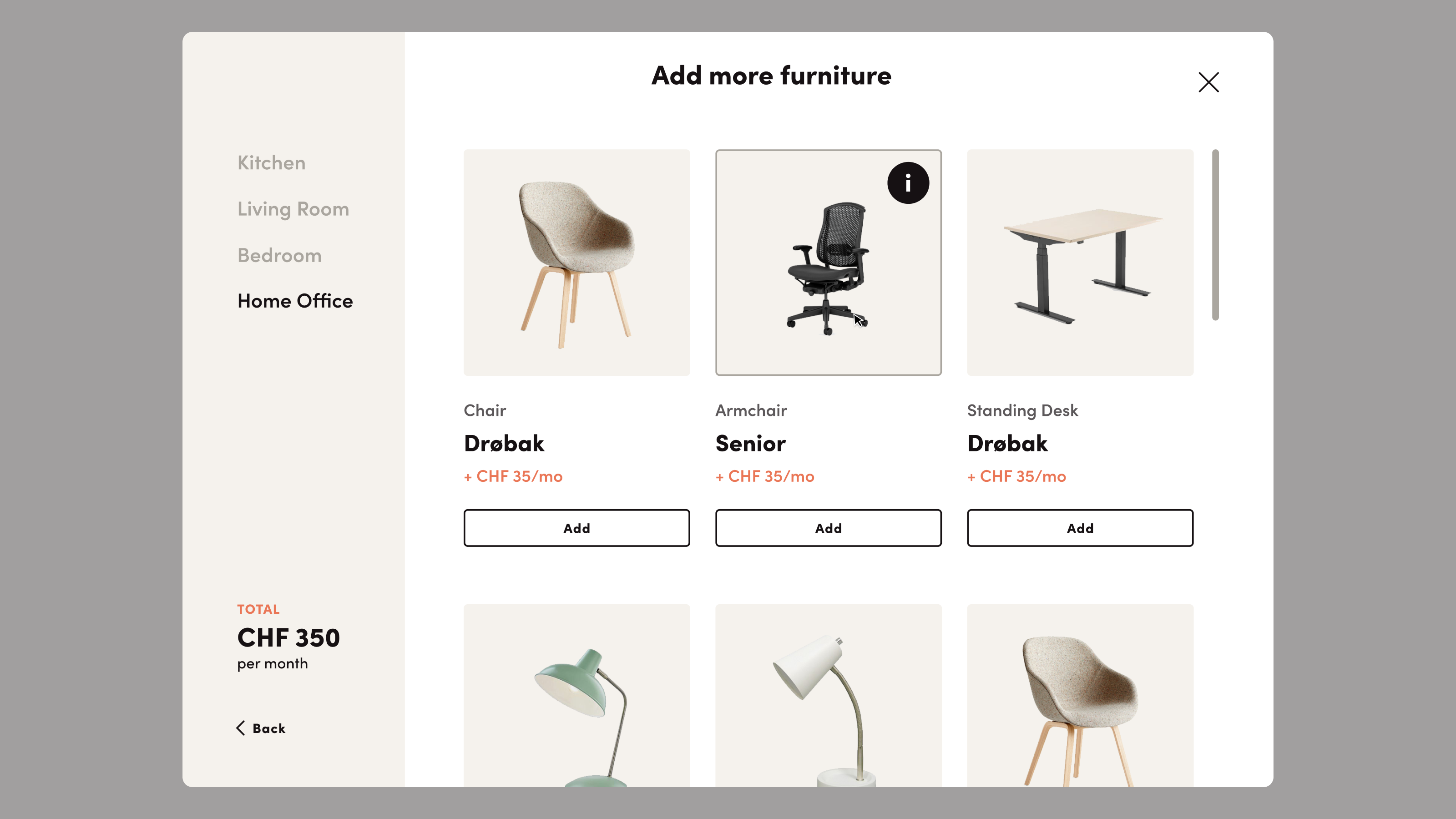

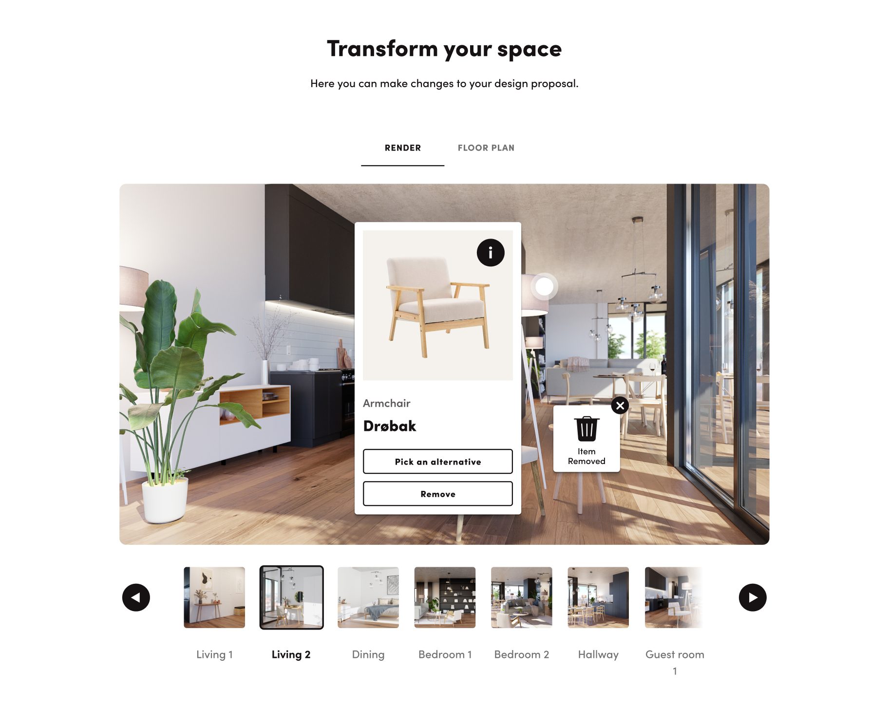
The interface for modifying the interior design proposals was the trickiest part of the project. Through it, customers can pick furniture and review its information or swap it for another design, all of this directly from the previsualization renders sent to them.
Me and the client were pretty satisfied with the result. The brand feels now approachable but not cheap and also looks quite different to its direct competitors.
Bea Barquero | Illustration & Additional UI/UX design
Nart Alkass | Animation